To make color matching easy, focus on understanding the palette techniques stylists use. Start with a core set of neutrals like black, white, or beige, and build around that with complementary or analogous colors. Recognize how personal features help choose flattering shades. This approach simplifies outfit coordination, making it feel natural and effortless. Keep exploring these principles, and you’ll discover even more tips for creating stylish, harmonious looks with confidence.

Get the latest gadgets delivered free with Prime
- Fast, free delivery on millions of items
- Prime Video, Amazon Music and more included
- Member-only deals all year
Key Takeaways
- Use complementary colors on the color wheel for vibrant, eye-catching pairings.
- Incorporate analogous colors for harmonious, cohesive outfits.
- Determine personal skin undertones to select flattering hues.
- Establish a neutral core palette to simplify mixing and matching.
- Apply understanding of color relationships and personal features for confident styling.
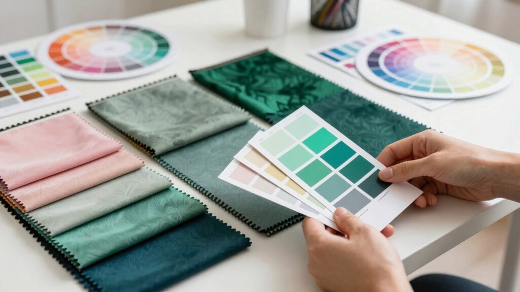
Matching colors can seem intimidating, but with a few simple tips, it becomes straightforward and even enjoyable. One of the best ways to master color matching is to understand the basics of color theory. Color theory provides a framework that helps you see how different hues interact, making it easier to create harmonious combinations. It’s not about memorizing complicated rules but about recognizing which colors naturally complement each other. For example, colors opposite each other on the color wheel, like blue and orange, are complementary and often work well together. Similarly, analogous colors—those next to each other, like blue, teal, and navy—create a cohesive, soothing look. Once you grasp these fundamentals, mixing and matching becomes less guesswork and more about intentionally choosing colors that enhance each other. Understanding color relationships is key to creating visually appealing combinations effortlessly.
Understanding color relationships makes matching outfits simple and stylish.
Personal color analysis is another valuable tool that stylists rely on to streamline color matching. By identifying your unique skin tone, eye color, and hair shade, you can determine which hues flatter you most. This process helps you develop a personalized palette that complements your natural features, making your overall look more polished and harmonious. For example, if your skin has warm undertones, you’ll tend to look best in earthy tones like warm browns, oranges, and golds. Conversely, cooler undertones suit jewel tones like emerald, sapphire, and icy blues. When you incorporate personal color analysis into your wardrobe planning, you’re less likely to feel overwhelmed by choices and more confident in selecting colors that make you look vibrant and put-together.
A simple palette trick that stylists swear by is creating a core set of colors that serve as your base. Think of these as your foundation—neutral shades like black, white, beige, or gray. Once you have these basics, you can add pops of color through accessories or statement pieces. This approach makes it easier to mix and match without clashing, because your neutrals act as a cohesive backdrop. When you understand the principles of color theory and leverage your personal color analysis, choosing the right shades becomes instinctive. You’ll soon find that you can put together outfits that look intentional and vibrant, all while feeling comfortable and confident.
In the end, mastering color matching isn’t about complicated rules but about understanding the relationships between colors and how they work with your unique features. By applying color theory and personal color analysis, you’ll develop a keen eye for harmonious palettes. With practice, selecting clothes and accessories will become a quick, satisfying process—no more second-guessing, just stylish, coordinated looks that reflect your personal style.
Products Worth Considering

Samsung Odyssey G7 40-Inch WUHD Curved Gaming Monitor (G75F)

LG UltraGear 32GS60QC-B 32-inch Curved QHD Gaming Monitor (180Hz, 1ms, 1000R, AMD FreeSync, HDR10)

Bose QuietComfort Headphones (2nd Gen), Wireless Over-Ear Noise-Cancelling Headphones, Eucalyptus Green
As an affiliate, we earn on qualifying purchases.
Frequently Asked Questions
What Are the Best Tools for Color Matching at Home?
You can use digital color matching tools like smartphone apps that analyze colors from objects or photos, helping you apply color theory effectively. Color wheels and swatch books are also great for visual comparisons, while understanding color psychology guides your choices for mood and vibe. These tools help you match shades accurately at home, making your color coordination more confident and stylish.
How Do I Match Colors for Different Skin Tones?
To match colors for different skin tones, start by identifying your undertone—warm or cool. Use complementary contrasts, like jewel tones for cool undertones and earthy shades for warm ones, to enhance your natural glow. Explore seasonal color palettes—spring, summer, autumn, winter—to find hues that harmonize with your skin. Experiment with shades within these palettes to see what makes your complexion pop and feels authentic.
Can Color Matching Be Done Digitally?
Yes, you can do color matching digitally. With digital color calibration tools, you guarantee your screens display accurate colors. Online color palettes help you choose complementary shades effortlessly. You simply select your desired hues, and these tools assist in matching colors precisely, making it easier to coordinate outfits or design projects. This method saves time and minimizes color miscommunication, giving you confidence in your color choices every time.
How Do I Match Colors in Patterned Clothing?
Think of your outfit as a symphony, where each pattern plays a essential role. To match colors in patterned clothing, focus on pattern coordination by choosing one dominant hue and pulling secondary colors from it. Use color mixing techniques like pairing complementary shades or sticking to analogous tones. This approach keeps your look harmonious, allowing your patterns to blend seamlessly without clashing or overwhelming your style.
What Are Common Color Matching Mistakes to Avoid?
You should avoid common color matching mistakes, like ignoring color psychology and seasonal color analysis. Don’t clash bold colors or pair too many contrasting shades, as it can overwhelm your look. Instead, focus on colors that complement your skin tone and seasonal palette. Stay mindful of harmony, and use subtle shades to balance vibrant hues. This approach guarantees your outfit looks intentional, polished, and visually appealing.
Conclusion
Now that you know the palette trick, matching colors becomes a breeze—no need to summon a wizard or consult an ancient tome. Just trust your eye, pick harmonious shades, and embrace your inner stylist. Remember, even the most seasoned fashionistas once relied on simple tools to create stunning looks. So go ahead, channel your inner Marie Antoinette, and turn your wardrobe into a masterpiece. After all, style is just a clever palette away from perfection.