
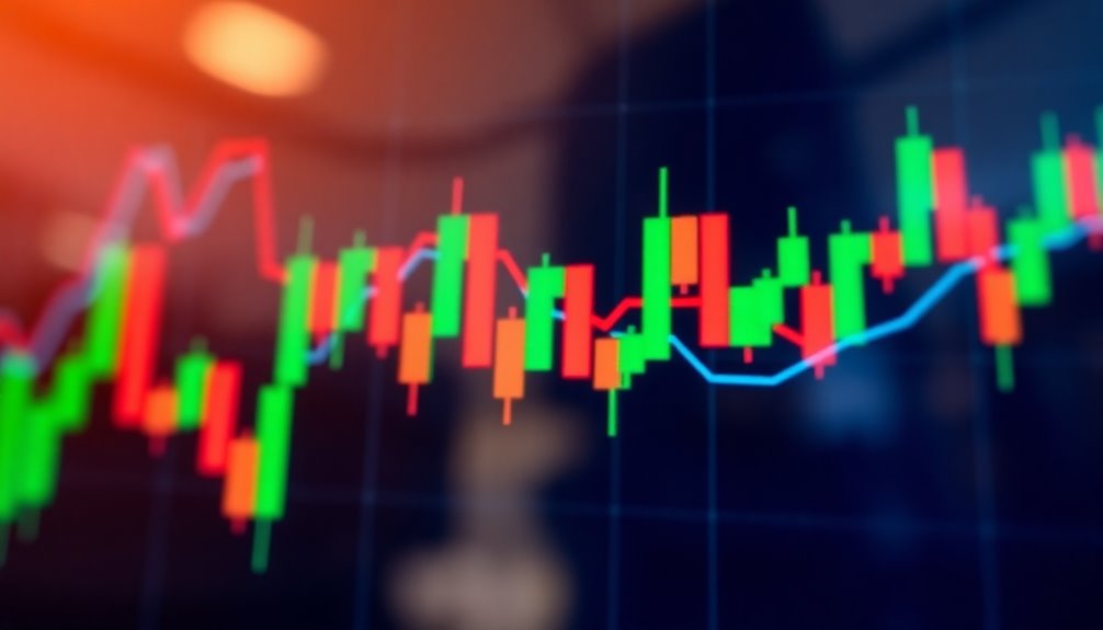
A candlestick is a visual tool used in technical analysis to depict price movements over time. Each candlestick consists of a real body that shows the open and close prices, while the shadows indicate the highest and lowest prices during a given period. A filled body reflects bearish sentiment, while a hollow body indicates bullish movement. These charts help you quickly grasp market trends and sentiments, making them popular for traders. As you explore further, you'll uncover various patterns and strategies that can enhance your trading decisions even more.
Key Takeaways
- A candlestick is a visual representation of price movements in a specific timeframe, showing open, high, low, and close prices.
- It consists of a real body, which indicates the price range between opening and closing, along with upper and lower shadows.
- A filled body represents bearish movement, while a hollow body indicates bullish movement, aiding in market sentiment analysis.
- Candlestick patterns, like Hammer or Shooting Star, help traders identify potential price trends and reversals.
- Compared to line charts, candlestick charts provide more detailed insights, including volatility and price action nuances.

Swing Trade Blueprint: A Basic Guide to Profitable Short-Term Investing
As an affiliate, we earn on qualifying purchases.
As an affiliate, we earn on qualifying purchases.
Candlestick Structure Overview
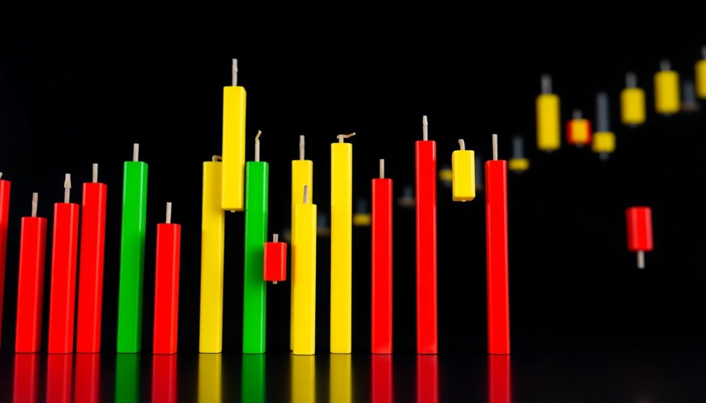
Candlestick charts are a powerful tool for visualizing market movements. Each candlestick consists of a real body that shows the price range between the opening price and closing price for a specific time period.
If the body is filled, it indicates a bearish movement, meaning the closing price is lower than the opening price. Conversely, a hollow body signifies a bullish movement, with the closing price higher than the opening price.
The upper shadow represents the highest price reached, while the lower shadow indicates the lowest price during that period. The length of the real body and shadows can reveal market sentiment, with longer bodies suggesting stronger price movements and shorter ones indicating indecision.
Understanding these elements is key to analyzing market trends.

Trading: Technical Analysis Masterclass: Master the financial markets
Language: english
As an affiliate, we earn on qualifying purchases.
As an affiliate, we earn on qualifying purchases.
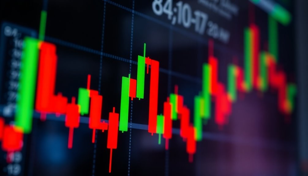
Candlestick Chart Overview
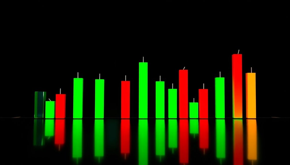
A candlestick chart serves as an essential tool for traders, providing a clear visual representation of price movements over a specific time period. Each candlestick displays the open and close prices along with the high and low, allowing you to analyze price action at a glance.
The real body indicates the range between the open and close, while the shadows reveal the highest and lowest prices. Bullish patterns, like the Hammer and Bullish Engulfing, suggest potential price increases, whereas bearish patterns, such as the Shooting Star and Bearish Engulfing, hint at possible declines.
Originating from Japanese candlestick techniques, these charts are crucial for technical analysis, reflecting market sentiment through color-coded bodies that show bullish or bearish trends.
A Visual Guide of Candlestick Patterns and Chart Setups: Learn how to Identify Pattens and Trade them with 50+ Real Charts
As an affiliate, we earn on qualifying purchases.
As an affiliate, we earn on qualifying purchases.
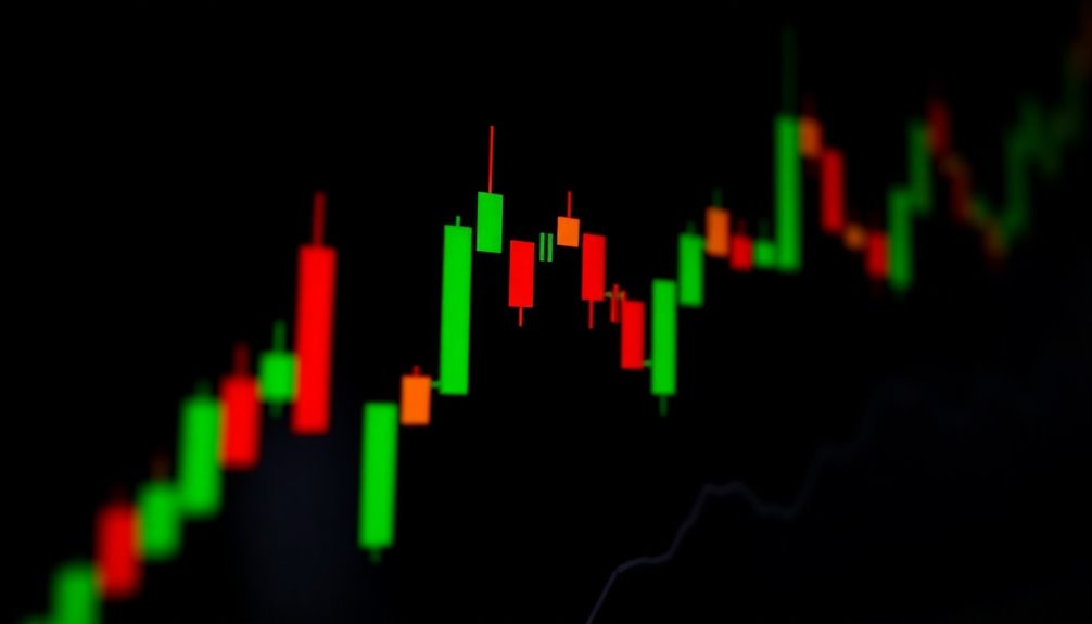
Price Movement Visualization Method
Visualizing price movements effectively is crucial for traders seeking to make informed decisions. A candlestick serves as a powerful tool, summarizing the open, high, low, and closing prices within a specific timeframe.
Each candlestick consists of a real body that highlights the range between the opening and closing prices, while the shadows indicate the highest and lowest prices. The body's color conveys market sentiment—green for bullish and red for bearish—reflecting whether the closing price is higher or lower than the opening.

Candlestick Charting Explained Workbook: Step-by-Step Exercises and Tests to Help You Master Candlestick Charting: Step-By-Step Exercises And Tests To Help You Master Candlestick Charting
Used Book in Good Condition
As an affiliate, we earn on qualifying purchases.
As an affiliate, we earn on qualifying purchases.
Strengths and Weaknesses

Understanding the strengths and weaknesses of candlestick charts can significantly impact your trading strategy. One of the main strengths is their ability to visually represent price movement, allowing you to quickly gauge market sentiment.
By recognizing specific candlestick patterns, like the bullish engulfing pattern or bearish harami, you can enhance your trading decisions and pinpoint potential entry and exit points.
However, these patterns aren't foolproof indicators; they can provide false signals. This highlights a weakness, as interpretation can be subjective, leading to inconsistencies in your technical analysis.
To mitigate this, it's crucial to combine candlestick patterns with other technical indicators, such as momentum indicators, for more accurate trading decisions.
Candlestick vs. Line Charts
While both candlestick and line charts serve to represent price movements, they do so in markedly different ways that can influence your trading decisions.
Candlestick charts provide a detailed view by displaying open and close prices, along with high and low points, which helps you gauge market sentiment. You can easily identify bullish and bearish movements through color coding, making it simpler to spot patterns essential for technical analysis.
Though line charts offer a cleaner look, they only show closing prices, limiting insights into market volatility and price action. For short-term trading strategies, candlestick charts are often preferred, as they give immediate visual cues about trends and potential reversals that line charts may overlook.
Market Volatility Impacts Accuracy
Market volatility significantly impacts the reliability of candlestick patterns, making it crucial for traders to be cautious. Rapid price fluctuations can lead to false signals, complicating the accuracy of technical analysis.
You might notice longer wicks on candlesticks during volatile periods, indicating price rejections that can obscure market sentiment. Additionally, the rise in price gaps can make it tougher to identify consistent trends or reversal patterns.
To navigate this uncertainty, you may need to adjust your strategies and incorporate additional indicators like Bollinger Bands or the Average True Range (ATR).
Emerging Candlestick Analysis Techniques
Several innovative techniques are emerging in candlestick analysis that can enhance your trading strategies.
Traders are now leveraging automated trading systems that utilize candlestick charting to identify patterns and execute trades based on predefined criteria. By integrating sentiment analysis from social media and news, you can gain additional context on market trends, improving your trading accuracy.
Advanced charting software also provides real-time alerts for specific candlestick patterns, allowing you to respond swiftly to potential trading opportunities.
Additionally, multi-timeframe analysis is gaining popularity, as it helps you examine candlestick patterns across different timeframes for a more comprehensive view of price movements and possible reversals.
Embracing these techniques can significantly boost your trading effectiveness.
Use Multiple Timeframes for Analysis

Using multiple timeframes for candlestick analysis can significantly enhance your trading strategy by providing a fuller picture of market trends.
By examining candlestick patterns across longer timeframes, like daily or weekly charts, you can identify overall trends. Then, drill down to shorter timeframes, such as 15-minute or hourly charts, for precise trade execution.
This method helps you spot confirmation signals, like a bullish reversal on different charts, reinforcing your decisions on entry and exit points. Additionally, analyzing discrepancies between timeframes aids in risk management, highlighting potential areas of concern or opportunity.
Ultimately, integrating insights from multiple timeframes makes your trading decisions more informed and effective.
Frequently Asked Questions
What Is Candlestick in Trading?
When you look at trading, you'll find candlesticks are essential for analyzing price movements. Each candlestick represents a specific time period and shows you the open, high, low, and close prices.
The color of the body indicates whether the market closed higher or lower than it opened, helping you gauge market sentiment. By recognizing patterns, you can identify potential reversals and trends, enhancing your trading decisions and overall strategy.
What Is the Meaning of the Candlestick?
When you look at a candlestick, you're seeing a visual representation of price movement over time.
The body indicates the range between the opening and closing prices, while the shadows show the high and low prices reached.
If the body is filled, it means the price closed lower than it opened, and if it's empty, it closed higher.
This helps you gauge market sentiment and potential price trends effectively.
What Is Candlestick Psychology?
Imagine the market as a living organism, its pulse reflected in candlestick psychology.
It's the art of reading the emotional undercurrents driving traders' decisions.
You'll notice that each candlestick tells a story—green ones whisper of optimism, while red ones shout caution.
Patterns like Dojis and Hammers reveal indecision or possible reversals, helping you navigate the chaotic dance of buyers and sellers, ultimately sharpening your trading instincts and decisions.
What Is the 3 Candle Rule?
The 3 Candle Rule helps you identify potential market reversals or continuations by observing three consecutive candles. When you spot three green candles, it usually indicates strong upward momentum, while three red candles can signal downward movement.
You should also pay attention to their closing positions; three higher closes suggest a bullish trend, whereas three lower closes indicate bearishness.
Context is crucial, so consider market conditions and other indicators to enhance your trading strategy.
Conclusion
In the world of trading, mastering candlestick patterns opens doors to a wealth of insights. By embracing these visual tools, you're not just reading charts; you're deciphering the market's hidden whispers. While they shine a light on price movements, remember that they're not foolproof. So, keep your eyes peeled and your strategies flexible. As you navigate the waves of market volatility, let candlesticks guide your journey, helping you make informed decisions in the pursuit of profit.